Symbian
Creating a refreshingly friendly, open technology brand for developers and programmers
Background
Symbian was the world’s largest mobile phone operating system. It was the brain in hundreds of millions of handsets globally, and held a 60 percent market share. That’s three times the market share of
RIM Blackberry, and five times that of Windows Mobile.
In June 2008 Nokia acquired the rights to Symbian with the intentions of making it open source. In order to help increase innovation, Nokia agreed to release the Symbian
code and create a royalty-free open platform.
To do this they created the Symbian Foundation, a not-for-profit entity to manage the Symbian platform and maintain relationships with its developers, programmers and partners.
Challenge
Although
Symbian had no plans to change its name, it was changing into a new company that offered a fundamentally different proposition.
Because of its legacy, there were plenty of well-established preconceptions about what Symbian
was and what it did. Additionally, most end consumers had no familiarity with the brand, something the Foundation was keen to change.
Symbian needed a brand that built on its existing equities as a trusted market leader,
while signalling its fresh start in a compelling and exciting way.
Solution
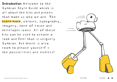
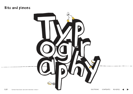
The new identity captures the essence of the open source spirit — championing collaboration, creativity, freedom, and community.
While the rest of the mobile technology industry feels slick, sophisticated, and standoffish, Symbian breaks category conventions. It uses hand drawn illustrations and a heart in its identity system to express the humanity in its
technology. It’s open and friendly. It’s human and personable. Now Symbian can engage in a dialogue with developers and end consumers alike.
Awards
Cannes Lions
Shortlisted – Best Corporate Rebrand

Design Week Awards
GOLD – Corporate Branding